Screen Configurations
You can design your UIs in the same scene for different screen types, sizes and / or orientations. This is called "Responsive Design".
In the Resolution Monitor you can configure for which kinds of screens you want to support responsive design.

When you hit the big plus button you can add a new Screen Configuration.
When choosing the Name for the configuration, be careful: It is also the identifier for it which should not be changed once used.
Controls

You can click on the name of a Screen configuration to simulate it. A second click releases it from the simulation. This works like in the Pick Resolution Window.

This button allows you to rename or delete the screen configuration.
Do this with care!
If you have any UI Element which has a setting for the renamed or deleted screen configuration, that config will break. Unfortunately there is no way to automatically find objects with connections to certain screen configurations, so you would need to know all or go manually through all UI elements of your application to find them.
So, you should only delete or rename a screen configuration if you didn't use it yet or if you know where it was used.

Use these buttons to reorder the screen configurations. This is important because they are processed in order. The higher they appear in the List, the more likely they apply. See Fallback Logic below for more information.
Optimized Screen Size
In this section the Optimized Resolution and Optimized DPI is defined which is used as reference for the Size Modifiers to calculate the correct sizes for the actual resolution.
Usually you always want to have the same values here but have switched width and height for Landscape and Portrait configurations. It is a good practice to use the resolution your artist also uses for creation of UI sprites.
Settings
Specify the conditions for the detection of the screen configuration. You can specify one or more of the following conditions:
- Check Screen Orientation
Detects if the screen is in Landscape or Portrait mode (if it can change during runtime, don’t forget to call IngameResolutionMonitor.Create() at startup) - Check Screen Size
You can check if the height, width or diagonal size of the screen is in between certain values. These values can be specified in inches or centimeters. - Check Aspect Ratio
Checks if the current aspect ratio is between the given values – or not in between them (inverse). There is a drop down which helps finding the right values. - Check Device
If you deploy to different platforms you can check the type of screen here (Desktop, Console, Handheld, Virtual Reality, Touch Screen or Other) - Check Tag
You can introduce your own custom screen tags and trigger them through code. Check one of your tags with this setting to apply your custom layout.
You can trigger a tag like this: TheraBytes.BetterUi.ResolutionMonitor.AddScreenTag("Accessibility_Mode");
You can also revert the tag trigger like this: TheraBytes.BetterUi.ResolutionMonitor.RemoveScreenTag("Accessibility_Mode");
To remove all custom tags, write: TheraBytes.BetterUi.ResolutionMonitor.ClearScreenTags();
After the Condition Section there is the fallback Order section where you can specify fallbacks for the screen configuration (see below) if there is more than one.
Fallback Logic
The fallback logic of Screen Configuration is flexible and complex and therefore not so easy to understand. Here is how it works.
The Resolution Monitor knows, which screen configurations are active (where all conditions are true) and which not.
- The UI Element checks, if it has a special setting for any of the currently active screen configurations (starting from top).
- If it doesn't have a setting for the current screen configuration, it goes through the upper most currently active screen configuration (marked with ♦¹) and checks if it has any of the fallbacks.
- This is repeated with the fallbacks of the other active screen configurations (from top to bottom) until a fallback is found.
- If it couldn't find any match, it uses the Fallback Configuration.
Example
|
You have the following screen configurations:
The order above is good. The most special case should always be on the top (so it is checked first). To understand how to set up the fallbacks, let’s understand the problem: We have a UI Element which specifies a setting for “Landscape Small” only (as well as the default fallback).
The Resolution Monitor detects “Landscape Large” and “Landscape” (but not "Landscape Small").
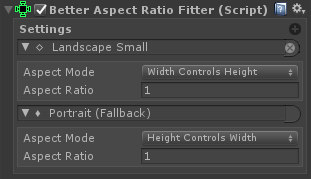
These Screen Configurations are not specified in the UI Element, so it will use the fallback logic. In the given case, the first detected entry (“Landscape Large”) is chosen as current screen config. If it contains "Landscape Small" in the fallback list, this config is used. If not, the next detected config ("Landscape") is checked also for "Landscape Small" in the fallback list. If all fails it will choose the global Fallback configuration (called "Portrait (Fallback)" in the screenshot). Because all three configurations essentially checking for landscape mode, it makes sense to define fallbacks to the others configs. The fallbacks should be specified as this:
|


